I feel like I've done this a couple of times... Oh wait, I have! Branding is one of my favourite parts of a business, and I didn't even know it until after I'd start the business and slapped a half-hearted banner up on my Etsy shop. I didn't even consider that the brand I was making was going to decorate every item, every scrap of paper, associated with my business, until I realised that I wanted labels. Then, that my labels looked kind of boring.
So I made some labels and matching hang-tags. Then I needed business cards, so I squeezed them in. Then I needed various images, and I found I was at a need for more fonts, and more images, and more paper items, and before I knew it my brand was all ajumble again, in a matter of a few months. With the introduction of my large collar line, my labels now looked very small, and I had no way to up-size them for my large collars.
So today, after sewing a bunch of collars, I decided I was going to look through my branding, identify the weaknesses, and fix them. I laid out the basis of my old brand: the colours, the fonts, and the patterns I was using, as well as my old logo.
How very un-inspired. I'd picked Goudy Stout for its strength, and the Bergamot Ornament was cute at the time. DK Claire De Lune sort of matched the Bergamot Ornament, when it became evident I needed a simple font, and Clementine Sketch was super fun to use on large announcement banners for Facebook. But it all felt so boring and cluttered when put together. I still like Goudy Stout, but the other fonts felt too complicated and overwhelming, and the colours were just too much.
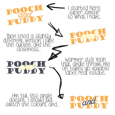
After tackling the colours, I decided to work on my logo first. I wanted to stop using the Bergamot Ornament, and my recent love of outlined font bubbled to the surface. I fiddled, and fiddled, and came up with a passable logo and miniature branding board. I decided that I had to add my pets to my branding, so I did. They're extremely tiny here, but you can still see the supreme cuteness.


No comments:
Post a Comment